Logo/Branding
A college professor once told me a logo is like your outfit; you're going to stop and think about what you wear before you go outside because that is how the world will see you. Well, the same is true for a logo. It represents the company, but doesn't get a chance to change daily so it needs to be designed well!
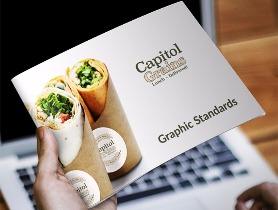
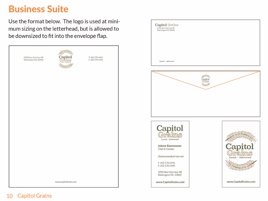
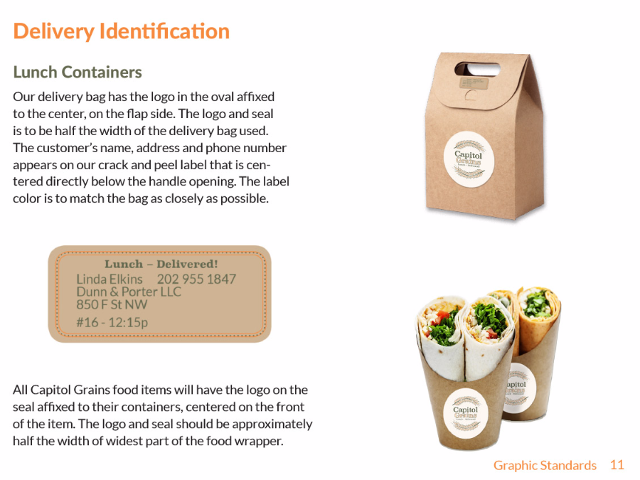
Capitol Grains (Branding Suite)
Capitol Grains is created to be a lunch delivery-only company with an emphasis on healthy food for the Washington DC area. I designed the branding suite, advertisements, and Graphics Standards Manual for this school project.
I created the shape of the logo as a play on the dome of the Capitol Building, and also to emphasize the curves of the "C" and "G" in Capitol Grains. The lines of the grains themselves were created by using lines styled from the Archistico typeface (which is used in word "Grains" in the logo).
Graphic Standards Manual
iCan Dance, iCan Swim for iCan Shine.org
iCan Shine is an international nonprofit providing learning opportunities in recreational activities for persons with disabilities. Their "iCan Bike" program began in 2007, and has taught approximately 20,000 people with special needs to successfully ride a 2-wheeled bike. For more information, please visit iCan Shine, Inc.
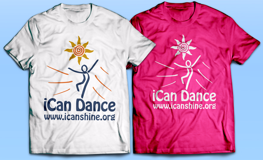
iCan Shine needed logos for their new dance and swim programs. Both logos had to appear as the same figure from their iCan Bike logo. Here is what I designed for them to use for their brochures, t-shirts, etc.

